WorkSmart Asia

Hot news & trending topics of interest to working adults in Asia Pacific/Middle East businesses.

Pages

  • Home
  • About WorkSmart Asia
  • Author
  • Glossary
Showing posts with label colour. Show all posts

31 March 2024

L'Oréal unveils iNOA Red Nebula line of hair colour

Source: L'Oréal Professionnel. The Chic Crimson Collection 2024. Four ladies with hair coloured various shades of red.
Source: L'Oréal Professionnel. The Chic
Crimson Collection 2024
features iNOA
Red Nebula.
L'Oréal Professionnel has unveiled the next generation of reds in hair colour with iNOA Red Nebula, a line of hair colour that celebrates the connection between the colour red and the unique characteristics of women. According to L'Oréal, red embodies strength, passion, power, courage, confidence, love, energy, and allure.

This breakthrough shade collection offers up to 100% grey coverage and a visible improvement in hair quality, making it 48% shinier. At its core lies the company's patented Oil Delivery System (ODS) technology, which has a 60% oil-based vegan formula. INOA Red Nebula also ensures optimal scalp comfort, eliminating unpleasant odors associated with conventional processes. iNOA is also tested water permeable or wudhu-friendly, making it suitable for Muslim customers.

L'Oréal Professionnel's iNOA [iD] integrates augmented reality and colour analysis. It encompasses a five-step process, factoring in grey hair percentage, coverage type, regrowth, length shade, and hair reflect - additional colours that appear in the hair in natural light. The virtual try-on feature allows clients to visualise the two new Red Nebula shades, 4.26 and 5.26.

Details

The new iNOA Red Nebula is available at L'Oréal Professionnel hair salons throughout Malaysia and Singapore. 

Explore

Locate your nearest L'Oréal Professionnel salon at https://hair-salon-en.lorealprofessionnel.com. 

Download the iNOA [iD] app at https://www.lorealprofessionnel.com/inoa

Hashtags: #iNOARedNebulaMYSG, #InnovationNoAmmonia, #iNOABestColor, #iNOATelusAir, #iNOAiD, #mylorealpro, #lorealprosg, #haircolor, and #noammonia

Posted by JT at 22:35
Email ThisBlogThis!Share to XShare to FacebookShare to Pinterest
Labels: colour, dye, hair

3 January 2018

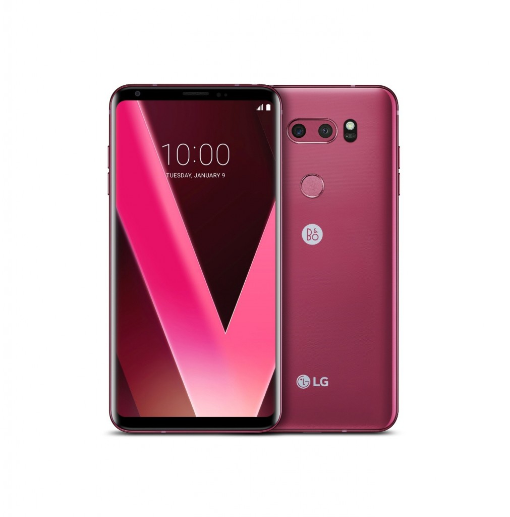
Raspberry Rose LG V30 to debut at CES 2018

Source: LG Electronics. The Raspberry Rose V30 smartphone.
Source: LG Electronics. The Raspberry Rose V30.
Visitors to CES 2018 will be the first in the world to experience LG Electronics’ newest colour for the flagship V30 smartphone. Raspberry Rose is a unique, intense version of red.

Offering a premium design in a slim and light package, the LG V30 boasts a number of exceptional multimedia features such as a dual camera for professional-level quality photos, with an upgraded wide angle lens for reduced edge distortion. Superb sound is driven by an advanced Hi-Fi Quad digital-to-analogue converter (DAC) and audio tuning by the specialists at B&O PLAY.

The V30 is already available in Aurora Black, Cloud Silver, Moroccan Blue and Lavender Violet.

Details:

The LG V30 Raspberry Rose will roll out in Korea soon after CES with key markets in Asia to follow.

Hashtag: #CES2018
Posted by J Tang at 23:30
Email ThisBlogThis!Share to XShare to FacebookShare to Pinterest
Labels: colour, LG, pink, smartphone

8 December 2017

Ultra Violet is the Pantone colour of the year for 2018

Source: Pantone. Ultra Violet 18-3838.
Source: Pantone. PANTONE Ultra Violet 18-3838.
Pantone, a wholly owned subsidiary of X-Rite and provider of professional colour language standards and digital solutions, today announced PANTONE 18-3838, Ultra Violet, as the Pantone Color of the Year for 2018. PANTONE 18-3838 Ultra Violet communicates originality, ingenuity, and visionary thinking, the brand said.

For 19 years, Pantone’s Color of the Year has influenced product development and purchasing decisions in multiple industries, including fashion, home furnishings, and industrial design, as well as product packaging and graphic design.

“We are living in a time that requires inventiveness and imagination. It is this kind of creative inspiration that is indigenous to PANTONE 18-3838 Ultra Violet, a blue-based purple that takes our awareness and potential to a higher level,” said Leatrice Eiseman, Executive Director of the Pantone Color Institute. “From exploring new technologies and the greater galaxy, to artistic expression and spiritual reflection, intuitive Ultra Violet lights the way to what is yet to come.”

“We are living in a time that requires inventiveness and imagination. It is this kind of creative inspiration that is indigenous to PANTONE 18-3838 Ultra-Violet, a blue-based purple that takes our awareness and potential to a higher level,” said Leatrice Eiseman, Executive Director of the Pantone Color Institute. “From exploring new technologies and the greater galaxy, to artistic expression and spiritual reflection, intuitive Ultra Violet lights the way to what is yet to come.”

Historically, there has been a mystical or spiritual quality attached to Ultra Violet. The colour is often associated with mindfulness practices, Pantone notes. Musical icons Prince, David Bowie, and Jimi Hendrix have also brought shades of Ultra Violet to the forefront of western pop culture as personal expressions of individuality.

“The Pantone Color of the Year has come to mean so much more than ‘what’s trending’ in the world of design; it’s truly a reflection of what’s needed in our world today,” added Laurie Pressman, VP, Pantone Color Institute. “As individuals around the world become more fascinated with colour and realise its ability to convey deep messages and meanings, designers and brands should feel empowered to use colour to inspire and influence. The Color of the Year is one moment in time that provides strategic direction for the world of trend and design, reflecting the Pantone Color Institute’s year-round work doing the same for designers and brands.”

According to Pantone, Ultra Violet shades are increasingly used in packaging and graphic design by brands in the consumer packaged goods (CPG), luxury, and beauty worlds as well as by personalities and artists seeking to stand out.

In food

Considered exotic and enticing, purple fruits, vegetables, and starches, such as acai, purple shaded cauliflower, yams, carrots, asparagus and cabbage are also known for their natural health benefits. These new “it” foods are naturally rich in nutrients and antioxidants, and also bring vibrancy and sophistication to the table.

In fashion

Ultra Violet provides a theatrical linkage for both men’s and women’s styles. With golds or other metallics, Ultra Violet becomes luxurious and dazzling; with greens or greys it evokes natural elegance. Similarly, Ultra Violet takes on distinct appearances with different materials. Lush velvets in the colour suggest intrigue for evening, but are also unexpectedly modern in athleisure or sneakers. In accessories, jewellery, and eyewear, Ultra Violet suggests the complexities of natural gems, textures, and florals.

In beauty

The complex nature of the colour is well-suited for beauty looks created by combinations, blends, and ombres. A singular matte purple on the lips or nails makes a bold statement of non-conformity, while softly blended metallics and shimmers in Ultra Violet transform the eyes into windows to the cosmos. Purple shades in hair continue to elevate street styles as a symbol of creative expression. On the palette for every beauty medium, Ultra Violet complements and emboldens every other colour, adding complexity and mystery.

In home décor

In interiors, Ultra Violet can transform a room. In hospitality, Pantone is seeing purples like Ultra Violet take centre stage in interior spaces as hotels harness colour and design to entice travellers and stay relevant.

The Color of the Year selection process involves Pantone’s colour experts at the Pantone Color Institute combing the world looking for new colour influences. This can include the entertainment industry and films in production, travelling art collections and new artists, fashion, all areas of design, popular travel destinations, as well as new lifestyles, playstyles, and socioeconomic conditions. Influences may also stem from new technologies, materials, textures, and effects that impact colour, relevant social media platforms and even upcoming sporting events that capture worldwide attention.

Past selections for Color of the Year include:
Source: Pantone. PANTONE Greenery  was the 2017 Color of  the Year.
Source: Pantone.
PANTONE Greenery
was the 2017 Color of
the Year
.

PANTONE 15-0343 Greenery (2017)
PANTONE 15-3919 Serenity and PANTONE 13-1520 Rose Quartz (2016)
PANTONE 18-1438 Marsala (2015)
PANTONE 18-3224 Radiant Orchid (2014)
PANTONE 17-5641 Emerald (2013)
PANTONE 17-1463 Tangerine Tango (2012)
PANTONE 18-2120 Honeysuckle (2011)
PANTONE 15-5519 Turquoise (2010)
PANTONE 14-0848 Mimosa (2009)
PANTONE 18-3943 Blue Iris (2008)

Explore:

Read the WorkSmart Asia blog post about colours of the year for 2017

The Pantone Color of the Year 2018 Formula Guide (Coated & Uncoated) has a suggested retail price (SRP) of US$165

The Pantone Color of the Year 2018 Fashion, Home + Interiors Color Guide has a SRP of US$215
Posted by J Tang at 23:42
Email ThisBlogThis!Share to XShare to FacebookShare to Pinterest
Labels: 2018, colour, Pantone

8 July 2017

Bronze pink Xperia XZ Premium phones now available in Singapore

Source: Sony. The Bronze Pink Sony Xperia XZ.
Following the launch of the Sony Xperia XZ Premium in June, Sony Mobile has introduced the flagship in a third colour variant in Singapore – Bronze Pink.

The rosy pink hue will be rolling out progressively from selected retailers starting 8 July. The Xperia XZ Premium comes at a suggested retail price of S$1,098.

The Xperia XZ Premium is the world’s fastest smartphone with a 4K HDR Display, Sony said. The phone showcases Sony’s new Motion Eye camera system to enable advanced features and excellence in picture quality, including the world’s first super slow motion video capable of recording 960 frames per second (fps) video, four times slower than any other smartphone and 32 times slower than real time.

Predictive Capture stays one step ahead and automatically starts buffering images when it detects motion even before the user presses the button, so up to four shots are taken a second before the click.

The existing colour selections feature Deepsea Black and Luminous Chrome.

posted from Bloggeroid
Posted by J Tang at 14:39
Email ThisBlogThis!Share to XShare to FacebookShare to Pinterest
Labels: colour, Singapore, smartphone, Sony

11 December 2016

Denim Drift is AkzoNobel's Colour of the Year for 2017

Source: AkzoNobel. From left: Farhan Akhtar, Brand Ambassador, Dulux, Rajiv Rajgopal, Director, Decorative Paints, AkzoNobel South Asia Cluster, Jeremy Rowe, MD, AkzoNobel Decorative Paints, South East & South Asia, Middle East, Shraddha Kapoor, Brand Ambassador, Dulux, unveiled Denim Drift as the Colour of the Year for 2017.

AkzoNobel, the global paints and coatings company and a major producer of specialty chemicals as well as the makers of Dulux paints in India, has declared Denim Drift as the Colour of the Year for 2017.

As a part of the 14th edition of AkzoNobel's annual global study ColourFutures, Farhan Akhtar and Shraddha Kapoor, brand ambassadors of Dulux in India, unveiled Denim Drift and its overriding trend: Life in a New Light.

Every year, AkzoNobel's colour experts, international trend watchers and authorities from various fields of design come together at the company's Global Aesthetic Center to research and identify the social and design trends that will influence consumers in their colour and interior decoration choices for the coming year. The brand's overriding theme for the year ahead encourages consumers to celebrate a new look on the simple things that make life worth living.

"As the world changes, people are taking a fresh look at the everyday essentials of life - our family and friends, work, connecting with nature and the pleasure of experiences. It is befitting that Life in a New Light is the driving influence for 2017 and is seen in all our colour trends for the year," said Jeremy Rowe, MD, AkzoNobel Decorative Paints, South East & South Asia, Middle East.

"Blue is the colour of life, of everyday life," he added. "It is also a colour that is soothing and restful. Denim Drift seems to best describe the trend as the chosen shade appears to drift from being definitely indigo blue to a lighter blue-grey named Smoke Grey in our colour catalogues."

According to Rajiv Rajgopal, Director, Decorative Paints, AkzoNobel South Asia Cluster, "Dulux has been delivering essential colours to consumers in India through its range of innovative and best-in-class interior and exterior paint products. Denim Drift will be available via the Dulux range of interior and exterior paints, so that consumers can make it an essential part of their lives in 2017. The Colour of the Year 2017 and the complementing colour palette featuring a spectrum of blues and tones is a truly accessible paint palette that can be easily translated into architecture and interior decorating."

"The Colour of the Year 2017, Denim Drift, is an essential part of our everyday palette," said Farhan Akhtar, Brand Ambassador, Dulux. "When teamed with rich shades it will bring your walls to life and exude energy. With lighter tones it will bring a cool, calming and airy feel."

"Denim Drift is the must-have colour of 2017," observed Shraddha Kapoor, Brand Ambassador, Dulux. "It is truly adaptable, fitting into all life and interior styles, making it the perfect choice for reflecting the mood for 2017. Rightly observed by the team researching the colour trend blue is the colour of life, of everyday life. It is familiar and yet new."

Source: Pantone. Niagara.
The choice of Denim Drift mirrors Pantone's selection of Niagara, described as a denim blue, as one of the major colours for spring 2017. Pantone's 2017 colour is a green, however. Unveiled on December 8, PANTONE 15-0343 Greenery as the PANTONE Color of the Year selection for 2017. The yellow-green shade evokes the first days of spring when nature’s greens revive, restore and renew, Pantone said.

“While Serenity and Rose Quartz, the PANTONE Color* of the Year 2016, expressed the need for harmony in a chaotic world,” said Leatrice Eiseman, Executive Director of the Pantone Color Institute “Greenery bursts forth in 2017 to provide us with the hope we collectively yearn for amid a complex social and political landscape. Satisfying our growing desire to rejuvenate, revitalise and unite, Greenery symbolises the reconnection we seek with nature, one another and a larger purpose.”

Source: Pantone. Greenery.
Pantone points to the embracing of Greenery as an innate craving to be immersed in the physical beauty and inherent unity of the natural world. The company notes that the colour is emerging in urban planning, architecture, lifestyle and design choices globally, and called Greenery emblematic of the pursuit of personal passions and vitality.

“The tangy yellow-green speaks to our desire to express, explore, experiment and reinvent, imparting a sense of buoyancy,” said Eiseman. “Through its reassuring yet assertive vibrancy, Greenery offers us self-assurance and boldness to live life on our own terms, during a time when we are redefining what makes us successful and happy.”

In this spirit of reconnection, exploration and belonging, Pantone has partnered with Airbnb - a community marketplace that provides access to unique accommodations and experiences around the globe - to bring Greenery to life through an experience in early 2017. The collaboration, a first of its kind, was inspired by Pantone’s vision for Greenery and Airbnb’s community that connects travellers to magical experiences.

Where Greenery dominates:

Innovation
While often associated with environmentalism and nature, Greenery is also a unifying thread in tech and innovation because of its association with boldness, vigour and modernity, Pantone said. Many new apps, animation iconography and digital-first startups express this energy by using the riveting and attention-getting shade of green in their logos. Conveying progression and a pioneering spirit, Greenery portrays an entrepreneurial essence that aligns with the industries that have embraced it.

Fashion
The hue is a natural complement to a wide range of palettes. It provides a pop of colour in accessories and footwear, or as acts as a bold accent in a pattern. Prominent in fashion for men and women, as seen in the recent collections of Kenzo, Michael Kors, Zac Posen, and Cynthia Rowley, Greenery has also been shown in a variety of solids and prints in children’s wear.

Home décor and architecture:Adding Greenery through living walls, terrariums, botanically-themed wallpaper, paint, accent furniture and decor provides respite and breathing space while creating the illusion of nature indoors.
Bringing the outside in, the shade - like the plant life it represents - can improve self-esteem, reduce anxiety and heighten awareness of one’s surroundings, Pantone says.

Beauty
Greenery is deployed as a chic, confident punch of colour for hair, lips, eyes and nails. It is also a camouflaging base for natural beauty looks, with green makeup rooted in colour-correcting trends. A complementary colour to red shades, Greenery plays down ruddiness in the skin.

Food and beverage
Greenery is prominent in many health food trends today, including matcha, seaweed and avocado, while the growth of urban agriculture and indoor vertical farms brings the essence of Greenery to unexpected places. On the table, Greenery plates and chargers provide an appetising backdrop for food – making dishes pop and appear fresher. Greenery is also often used in design for the hospitality and culinary industries to convey organic healthfulness, PANTONE adds.

Graphic design
Because of green’s prevalence in nature, it maintains a perception of being inherently good for you and organic. People respond on a visceral level to the hue, making the eye-catching Greenery an ideal shade for many applications of graphic design. This is especially true for packaging, where the sight of Greenery provides an instant message of freshness.

The Color of the Year selection process requires thoughtful consideration and trend analysis. To arrive at the selection each year, Pantone’s colour experts at the Pantone Color Institute comb the world looking for new color influences. This can include the entertainment industry and films in production, traveling art collections and new artists, fashion, all areas of design, popular travel destinations, as well as new lifestyles, playstyles and socioeconomic conditions. Influences may also stem from new technologies, materials, textures and effects that impact colour, relevant social media platforms and even up-coming sporting events that capture worldwide attention.

For 17 years, Pantone’s Color of the Year has influenced product development and purchasing decisions in multiple industries, including fashion, home furnishings and industrial design, as well as product packaging and graphic design.

Past selections for Color of the Year include:

PANTONE 15-3919 Serenity and PANTONE 13-1520 Rose Quartz (2016), a combination of pink and bright blue
PANTONE 18-1438 Marsala (2015), a deep red
PANTONE 18-3224 Radiant Orchid (2014), a reddish purple
PANTONE 17-5641 Emerald (2013), a shade of green
PANTONE 17-1463 Tangerine Tango (2012), a reddish orange
PANTONE 18-2120 Honeysuckle (2011), a reddish pink
PANTONE 15-5519 Turquoise (2010)
PANTONE 14-0848 Mimosa (2009), an orangey yellow
PANTONE 18-3943 Blue Iris (2008), a purplish blue
PANTONE 19-1557 Chili Pepper (2007), a classic red
PANTONE 13-1106 Sand Dollar (2006), a light beige
PANTONE 15-5217 Blue Turquoise (2005), a teal
PANTONE 17-1456 Tigerlily (2004), a reddish orange
PANTONE 14-4811 Aqua Sky (2003), a light teal
PANTONE 19-1664 True Red (2002)
PANTONE 17-2031 Fuchsia Rose (2001), bright pink
PANTONE 15-4020 Cerulean (2000), a faded blue

Pantone shared the PANTONE Fashion Color Report Spring 2017 edition in September, including Greenery as one of the picks. The semi-annual PANTONE Fashion Color Report is published for the fashion industry by the colour experts at the Pantone Color Institute, and features the top 10 colours in fashion.

“One of the things that we saw this year, was a renewed sense of imagination in which colour was appearing in context that was different than the traditional,” said Leatrice Eiseman, Executive Director of the Pantone Color Institute at the time.
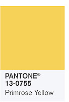
Source: Pantone. Primrose yellow.
“Reminiscent of the hues that surround us in nature, our Spring 2017 Fashion Color Report evokes a spectrum of emotion and feeling. From the warmth of sunny days with PANTONE 13-0755 Primrose Yellow to the invigorating feeling of breathing fresh mountain air with PANTONE 18-0107 Kale and the desire to escape to pristine waters with PANTONE 14-4620 Island Paradise, designers applied colour in playful, yet thoughtful and precise combinations to fully capture the promises, hope and transformation that we yearn for each spring.”

The top colours for spring 2017 fashion are:

PANTONE 17-4123 Niagara
Niagara leads the PANTONE Fashion Color Report as the most prevalent colour for spring 2017. Niagara is a classic denim-like blue that speaks to our desire for ease and relaxation.

PANTONE 13-0755 Primrose Yellow
Primrose Yellow sparkles with heat and vitality. This yellow shade takes us to a destination marked by enthusiasm, good cheer and sunny days.

Source: Pantone. Lapis blue.
PANTONE 19-4045 Lapis Blue
Conveying even more energy is Lapis Blue. Strong and confident, this intense blue shade is imbued with an inner radiance.

PANTONE 17-1462 Flame
A red-based orange, Flame is gregarious and fun loving. Flamboyant and vivacious, this theatrical orange shade adds fiery heat to the spring 2017 palette.
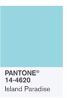
Source: Pantone. Island Paradise.
Source: Pantone. Island paradise.
PANTONE 14-4620 Island Paradise
Island Paradise is a blue green shade that speaks to our dream of the great escape.

PANTONE 13-1404 Pale Dogwood
Pale Dogwood engenders an aura of innocence and purity. Pale Dogwood is a subtle pink which infuses a healthy glow.

PANTONE 15-0343 Greenery
Greenery is a tangy yellow-green that speaks to our need to explore, experiment and reinvent. Illustrative of flourishing foliage, Greenery signals one to take a deep breath, oxygenate and reinvigorate.

Source: Pantone. Pink yarrow.
PApNTONE 17-2034 Pink Yarrow
Tropical and festive, Pink Yarrow is a whimsical, unignorable hue that tempts and tantalises. Bold Pink Yarrow is a captivating and stimulating colour that lifts spirits and gets the adrenaline going.

PANTONE 18-0107 Kale
Kale is another foliage-based green that conjures up a desire to connect to nature, similar to the more vivacious Greenery. This natural green shade provides the perfect complementary background to the more vibrant tones in the palette.

PANTONE 14-1315 Hazelnut
Rounding out the spring 2017 colors is Hazelnut, a key neutral for spring. This shade brings to mind a natural earthiness. Unpretentious and with an inherent warmth, Hazelnut is a transitional colour that connects the seasons.

Source: Pantone. Hazelnut.
The colours featured in the PANTONE Fashion Color Report and selected as the Color of the Year are taken from the PANTONE Fashion, Home + Interiors Color System, a recognised colour standards system for fashion, textile, home and interior design. To compose the report Pantone evaluated color sections by fashion designers showing collections at New York Fashion Week and other global shows to collect information on prominent collection colours, evaluating colour trends. The PANTONE Fashion Color Report serves as a reference tool throughout the season for fashion enthusiasts, reporters and retailers.

*Pantone broke with tradition in 2015 by announcing two colours for Color of the Year, instead of one.

posted from Bloggeroid
Posted by J Tang at 23:30
Email ThisBlogThis!Share to XShare to FacebookShare to Pinterest
Labels: 2017, colour, Pantone

26 January 2016

Lexmark launches seven new laser, multifunction models with game-changing features

The CS720/CS725 printer.
Source: Lexmark. The CS720/CS725 printer.

Lexmark has launched seven new A4 colour lasers and smart multifunction printers (MFPs), all enabled with Kofax TotalAgility from Lexmark to enhance the omnichannel capture strategy and help businesses become more efficient.

"A4 color MFPs continue to represent a very strong segment for worldwide MFP activity, with a high 10.5% growth rate expected throughout the forecast period," said Amy Machado, IDC Research Manager, Worldwide Hardcopy Peripherals Format Forecast, Q3 2015*. 

Driven by a quad core processor, these models boast the fastest print and copy speeds available in their respective A4 classes, Lexmark said. Many of the new colour laser devices also deliver the highest toner capacities in their class plus long life imaging components, resulting in fewer user interventions and Lexmark’s best ever colour TCO. 

The models featured in the new line include: Lexmark CS700 Series Printers, Lexmark CX700 Series MFPs, Lexmark CS800 Series Printers and CX800 Series MFPs. Lexmark’s champion offering, the CX860, offers the highest toner capacity, the largest input/output capacity and the most flexible media support of any A4 colour laser MFP. 

With a new tablet-like touchscreen interface and flexible media handling, these products are easy to use, require minimal training and enable future integration of business process solutions, such as our new OnboardingAgility. Onboarding Agility is a smart process application solution framework that dramatically reduces process complexity and shortens processing time to improve the onboarding experience for new customers.

"This Lexmark-created, game changing technology brings together the best of A3 and A4 technology in a new way, designed to optimise for managed print services and business process solutions,” said Marty Canning, Lexmark EVP and President of Imaging Solutions and Services. “With a lower TCO than ever before, Lexmark’s next generation large workgroup colour lasers are the ultimate in office productivity.”

Interested?

Read the TechTrade Asia blog post about Kofax TotalAgility

*IDC, Amy Machado, Research Manager, Worldwide Hardcopy Peripherals Format Forecast, Q3 2015.
Posted by J Tang at 23:00
Email ThisBlogThis!Share to XShare to FacebookShare to Pinterest
Labels: colour, laser, Lexmark, multifunction, printer

11 April 2015

Everyday Minerals rolls out mineral colour correctors

Source: Everyday Minerals website.

Everyday Minerals has introduced what it says are its best mineral color correctors yet. These totally natural colour correctors include jojoba esters as a key ingredient, which allow the correctors to mask imperfections without looking cakey.


The new Jojoba Color Correctors come in four shades for different results. The Brighten Color Corrector is a pink shade that has light-diffusing pigments to brighten dark under-eye circles instantly. The flesh-toned Cover Color Corrector can be applied after foundation to camouflage.

The other two Correctors are best used before foundation. The Mint Color Corrector neutralises redness, ruddy complexions, broken capillaries, and blemishes, while the yellow-tinted Sunlight Color Corrector is meant to help with dark spots, scarring and redness for fair to medium skin tones.

Each Color Corrector costs US$9 for 1.7g. Samplers are available as a kit for US$14.

Everyday Minerals is based in the US. All of its products are handmade and 100% vegan, sustainable, and cruelty free.
Posted by J Tang at 01:23
Email ThisBlogThis!Share to XShare to FacebookShare to Pinterest
Labels: colour, corrector, cosmetics, Everyday Minerals, jojoba, makeup, skin, vegan

18 February 2015

Nestlé to remove all artificial colours and flavours from chocolate

image description
Source: Nestlé.
Nestlé USA will remove artificial flavours and FDA-certified colours like Red 40 and Yellow 5 from all of its chocolate candy products by the end of 2015. The move will affect more than 250 products and 10 brands. Products will begin appearing on store shelves by mid-2015, and will be identified by a No Artificial Flavors or Colors claim featured on-pack.

“Nestlé is the world’s leading nutrition, health and wellness company and our commitment to remove artificial flavours and certified colours in our chocolate candy brands is an important milestone,” said Doreen Ida, President, Nestlé USA Confections & Snacks. 

“We know that candy consumers are interested in broader food trends around fewer artificial ingredients. As we thought about what this means for our candy brands, our first step has been to remove artificial flavours and colours without affecting taste or increasing the price. We’re excited to be the first major US candy manufacturer to make this commitment.”

Ingredients from natural sources can include annatto, which comes from the seeds found in the fruit from the achiote tree, Red 40 and Yellow 5 to replace the BUTTERFINGER centre. In CRUNCH, natural vanilla flavour will replace the artificial vanillin.

“We never compromise on taste. When making these changes to more than 75 recipes, maintaining the great taste and appearance consumers expect from the chocolate brands they know and love is our #1 priority,” said Leslie Mohr, Nutrition, Health and Wellness manager, Nestlé Confections & Snacks. “We conducted consumer testing to ensure the new recipe delivers on our high standards for taste and appearance.”
According to Mohr, this change affects Nestlé’s current portfolio of chocolate brands including NESTLE CRUNCH, BUTTERFINGER, BABY RUTH, SKINNY COW, RAISINETS, GOOBERS, SNO CAPS, 100 GRAND, OH HENRY and CHUNKY. 

Going forward, all newly launched chocolate and non-chocolate candy products (gummies, sours, etc.) introduced by Nestlé USA will be made without artificial flavours or colours. Additionally, Nestlé USA is actively pursuing the removal of caramel colouring from its chocolate products. Caramel colouring is an exempt-from-certification colour additive, which is used in nine of the more than 250 chocolate products.This follows similar moves by Nestlé in other parts of the world, the company said.
Posted by J Tang at 13:34
Email ThisBlogThis!Share to XShare to FacebookShare to Pinterest
Labels: artificial, Baby Ruth, Butterfingers, candy, chocolate, colour, confectionery, Crunch, flavour, manmade, Nestlé, Red 40, US, USA, Yellow 5

26 May 2014

Johnson & Johnson Acuvue performs well in Japanese tests

Johnson & Johnson Vision Care has announced that its 1-Day Acuvue Define and Acuvue 2 Define contact lenses have been mentioned positively in a report on popular brands of coloured and limbal ring contact lenses sold in Asia Pacific by The National Consumer Affairs Center (NCAC) of Japan. 

The NCAC report, Safety of Color Contact Lenses, stated that some manufacturers have inaccurately claimed "no pigment on the surface" of their lenses but highlighted that 1-Day Acuvue Define and Acuvue 2 Define lenses do indeed lack colour pigment on the surface of the lenses. Johnson & Johnson Vision Care's 1-Day Acuvue Define and Acuvue 2 Define contact lenses have the colorants embedded between two thin, transparent layers of lens material, and the design prevents the pigment from reaching the surface.

The 57-page NCAC report, co-sponsored by the Japan Ophthalmological Association and the Japan Contact Lens Society focused primarily
on two areas: product attributes and side effects. Issues raised by the NCAC report ranged from lenses being out of specification for base curve or diameter; lenses being too thick and potentially affecting oxygen transmissibility, to pigment found on the surface of lenses; as well as side effects like corneal swelling. 

According to Johnson & Johnson Vision Care, 1-Day Acuvue Define is the "one brand" referred to when the report stated: "Except for 1 brand, eye complications (corneal edema, corneal staining, or conjunctival staining), which require medical treatment or contact lens wear suspension (Efron grade 3, 4), were observed."

The report advises consumers to visit their eye care professional for regular eye exams and to consult on their correct usage and choice of coloured contact lenses.

Kathy Park, Area Vice President Asia Pacific, Johnson & Johnson Vision Care said, "Patient safety is our top priority and consumers and eye care professionals must feel confident in the contact lenses that they prescribe or wear on a daily basis."

"We have built rigourous quality checks into our processes to produce contact lenses that meet carefully controlled standards before leaving our manufacturing facilities. We trust this report will assure consumers that they can feel very confident when they, or their eye care professional, continue or choose to use our
1-Day Acuvue Define."
 

1-Day Acuvue Define is a leading brand of contact lenses in South Korea, mainland China, Singapore and Taiwan, and are currently available in most Asian countries. There are three variations available in Asia, Accent, Vivid Style and Natural Shine.

More information about the NCAC and its report is available here.
Posted by J Tang at 06:30
Email ThisBlogThis!Share to XShare to FacebookShare to Pinterest
Labels: Acuvue, colour, contact lens, Define, Japan, Johnson & Johnson, limbal ring, National Consumer Affairs Center, NCAC, Vision Care

28 January 2014

Konica Minolta picks up coveted BLI 'Line of the Year' award for 4th consecutive year

Buyers Laboratory (BLI), an independent authority and provider of competitive intelligence, testing and reviews for the imaging industry, has named Konica Minolta's A3 multi-function peripheral (MFP) family "Line of the Year" for a record fourth straight year.


"Line of the Year" is awarded once a year to vendors whose products are determined to be the best in their respective categories of models tested in BLI's two-month laboratory evaluation.

"What it boils down to with Konica Minolta is consistency," said George Mikolay, BLI's Senior Product Editor for A3/Copier MFPs. "Whereas competing lines may stand out in certain speed bands, or in either colour or black, Konica Minolta's engines stand out across the board - in reliability, ease of use and image quality - in virtually all speed bands in both colour and black. No other vendor brings the same quality of performance across its product line to the same degree."

He added, "The colour engines were found to quickly process and output users' jobs not only in BLI's real-world jobstream test, but also when printing sets and producing booklets, and scan speeds are the fastest or among the fastest in their respective groups. All of Konica Minolta's tested colour devices received high marks for both business graphics and photographic images, producing bright, saturated colour, natural flesh tones and smooth overall output." 


Konica Minolta's monochrome engines tested this year also earned high marks for printed image quality. "Even in copy mode, text was sharp, fine lines were consistent and halftone levels were distinct across all levels," noted Mikolay.
 

Source: Konica Minolta. The bizhub 554e.
Konica Minolta also elaborated on the BLI "Pick" award for Outstanding 51- to 60-ppm A3 Monochrome multi-function peripheral won by its bizhub 554e. BLI's "Pick" awards, presented twice annually, recognise the best performers in a comprehensive suite of tests that cover a wide range of the most important features and performance factors for buyers.


According to the BLI report, the Konica Minolta bizhub 554e won for superior reliability and unsurpassed image quality. 

"The bizhub 554e offers many great features, but above all, it's proven to be very reliable," said Pete Emory, BLI Manager of Laboratory Testing. The unit completed BLI's two-month, 200,000-impression test with only two misfeeds and no service required.
 
Konica Minolta's A3 business colour models include the "Pick"-winning bizhub C364e and bizhub C454e; the "Highly Recommended" bizhub C224e, bizhub C284e and bizhub C554e; and the bizhub C654e and bizhub C754e. Besides the "Pick"-winning bizhub 554e, Konica Minolta's A3 monochrome models include the "Highly Recommended" bizhub 284e and bizhub 364e, as well as the bizhub 654e and bizhub 754e, which are enhanced versions of models that earned "Highly Recommended" ratings.
Posted by J Tang at 20:38
Email ThisBlogThis!Share to XShare to FacebookShare to Pinterest
Labels: A3, BLI, Buyers Laboratory, colour, Konica Minolta, MFP, monochrome, printer
Older Posts Home
Subscribe to: Posts (Atom)

Search This Blog

Translate

Popular Posts

  • The Ritz-Carlton, Bali introduces Bejana by Petty Elliott
  • Reimagining Parkinson’s care
  • Discover dinner with foodpanda on ChatGPT and Claude
  • GO Focus Plus to help fleets prevent accidents
  • MBC Game Studio debuts Arabian fantasy action-adventure
  • Mastercard elevates premium travel with Asia Pacific’s first Taste by Priceless dining club

Past Posts

Subscribe To

Posts
Atom
Posts
All Comments
Atom
All Comments

Browse

  • Home
  • PR Newswire
  • GlobeNewswire
  • The blogging process
  • 14 pet peeves with press releases

Blogs of interest

  • TechTouch Asia
    Genesys Cloud as the agentic orchestration platform for customer experience
  • Suroor Asia
    ITFC signs US$1.5 B agreement with the Maldives
  • TechTrade Asia
    NVIDIA to acquire Hugging Face, retain open approach
  • sahafiun reactions & reviews
    Student Projects Bring Singapore’s Hidden Heritage to Life
  • Tech bytes for tea?
    Event: Samsung Galaxy Unpacked 2025 Launches Galaxy Z Fold7, Flip7 and Watch8
Content copyright 2026, J Tang. All brands and logos belong to their owners. Awesome Inc. theme. Theme images by Cimmerian. Powered by Blogger.